Theatre Crafts Magazine
Designers on Design: Susan Hilferty
by Beth Howard on January 5, 1990
When Sharon Ott decided to set the Berkeley Repertory’s production of Twelfth Night in the 1920s, costume designer Susan Hilferty suggested the director read Roger Shattuck’s The Banquet Years , a novel based in the period of France a few years prior to that roaring era. In the end, the novel’s surrealist style and sensibility set the tone for the production as a whole—costumes included.
“She was almost performing a dramaturgical function,” Ott says of the designer’s contribution to the play’s shifted focus. “She doesn’t just talk in terms of the line of the clothes. It’s the idea we’re trying to put across and how we can make it relate to now. There’s no one I feel as comfortable with talking about the entire play.”
Similar sentiments are expressed by the directors Hilferty works with often, particularly Ott, Athol Fugard, Robert Woodruff, Des McAnuff and Carole Rothman. More than a style or trademark, her career seems to be based on close collaborative relationships with various directors. “The thing that attracted me to being a designer attracted me to being in theatre,” she says. “It’s a collaborative art. I find that my designs are completely integrated into a production, and that I can never pull my clothes away and have them survive intact outside the production.”
Perhaps foremost among Hilferty’s frequent collaborators is South African playwright and director Athol Fugard, whom she met while she was a scenic and costume design student at Yale School of Drama nine years ago. Hilferty was randomly assigned as costume designer to Fugard’s production of A Lesson From Aloes . By both accounts the pairing was fortuitous; they have worked together almost continuously since then on such plays as The Blood Knot, A Place With the Pigs , and The Road to Mecca . Fugard praises Hilferty’s perception, “her ability to really understand what the play is trying to say and to relate that to how the design elements can be useful in conveying that to an audience.”
Fugard, who had scant experience with costume designers in his native South Africa, believes the relationship “has enabled me as both writer and director to take on a dialogue with somebody, and that is crucial for me, particularly in the statement of a new work.” He credits Hilferty with nothing short of revitalizing his work. “I don’t think it’s any accident that my most recent plays have been bold experimental efforts,” he says. “It’s become a sort of endless dialogue between us. We’re never not talking about the craft.”
A painting and fashion design student at Syracuse University, Hilferty’s interest in theatre and design took off during a year abroad in London where she went to the theatre three or four nights a week. Prior to the experience, she says, “I had seen very little theatre that could claim to have a design, a real design. I thought, “This is it.” Hilferty returned to the U.S. to work at the Berkshire Theatre Festival and then spent several years designing productions in New York. Eventually, she enrolled in the MFA program at Yale.
Since then she has lent her skills to an eclectic range of projects in theatres across the country and overseas. Hilferty has designed costumes for new vaudevillians the Flying Karamozov Brothers, worked on retakes of such classics as The Tempest and Twelfth Night , and been part of imaginative new productions such as Ubu(recently produced at Lincoln Center), and at La Jolla Playhouse’s The Matchmaker , Gillette , and 80 Days (an expansive period piece based on Jules Verne’s famous work). Last summer she designed the costumes for Lee Blessing’s new work, Down the Road , directed by McAnuff, and The Misanthrope , directed by Robert Falls, both at La Jolla. Her repertoire also includes dance (Alvin Ailey) and film (Laurie Anderson’s Home of the Brave ).
The productions have often offered Hilferty the chance to exercise her ingenuity and her noted sense of whimsy. “There’s a scene in Twelfth Night in which Andrew Aguecheek and Toby Belch were riding a sort of Jarry-surrealist-inspired bicycle around,” Ott remembers of the unique production. Hilferty had the characters’ clothes stiffened to look as if a stiff breeze was blowing them. In another scene, Toby Belch is dressed in evening wear that looks as if the character has been out all night. He is also wearing galoshes. “He looked like a regular guy, but there was also something slightly dangerous about him, a little bit over the edge,” Ott says. “That choice of the evening suit with the galoshes is a real Susan idea.”
“The show was filled with such ideas that were slightly beyond the realm of naturalism, but they never seemed as if the costume designer was making a point on her own,” Ott continues. “They always seem completely attuned with what the direction of the scene and what my intent was. She works very, very well with directors in terms of helping a director achieve an exaggerated vision without it seeming cute or gratuitous.”
Another frequent collaborator is director Robert Woodruff, who characterizes Hilferty’s approach as “not about answering questions, more about bringing them up. Not about a style, but about ideas.”
Collaboration took full force in Comedy of Errors , a production full of bizarre and imaginative images that featured the acrobatic antics of the Flying Karamozov Brothers. Initially, Hilferty says, “Nobody had a clue what we were doing. We literally built and designed throughout the rehearsal process. It was like being in this huge playpen.”
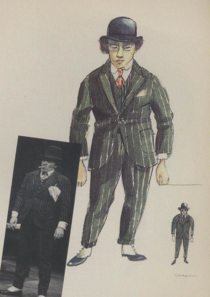
Out of the discussions between Hilferty, Woodruff and set designer Doug Stein two basic ideas emerged: a busy marketplace and Turkey. In the bold, exaggerated design that evolved, Hilferty sought to combine contemporary and Turkish images: a turban with baggy shorts, a paisley rayon shirt with leopard print shoes. “Since everybody plays at least three of four characters, with not a lot of time for changes,” she told Theatre Times , “and since these are not performers who do big acting transitions between one character and the next, the costume choices were big.” Thus, performers who were part of the band wore red clothing, fake noses, and dark glasses. Townspeople wore stripes and bright colors. Policemen dressed in pink costumes with reflective glasses, fake noses and helmets with flashing lights. “We used the word ‘stupid’ as a compliment,” Hilferty recalls, laughing, “ ‘Really stupid’ was high applause.”
As the production developed, one performer, Alec Willows, ended up with two roles, the Second Merchant and Angelo the goldsmith. The team decided to split him down the middle, each half of his body representing one of the characters. Two separate costumes, one made of gold lamé for the goldsmith, the other of black leather for the merchant, were literally cut in half and sewn back together. Willows even permed one half of his hair while bleaching the other.
The extraordinary physical demands of the performance presented more practical challenges, Hilferty says. Juggling, for example, requires tight fitting sleeves; juggling of fire limits the range of fabrics that can be used. “In fittings,” she adds, “this show was hilarious. Normally an actor comes to a fitting, lifts his arms and says, ‘Yeah, that’s okay, I can lift my arms, but I also have to turn around and sit on a chair.’ These guys go, ‘Well it feels okay,’ but then they’ll do a backflip, bring in a friend who stands on his shoulders, and cartwheel across the room.”
The process by which the play developed, Hilferty says, is ideal. “That’s the way I like to work,” she notes. “I spend a lot of time in rehearsal, with the actors, with the other designers. I find that’s the key to the work I do. And I like that it builds slowly within the idea of the production.”
The La Jolla Playhouse production of Figaro Gets a Divorce also evolved collectively. “We made major design choices that were so collaborative that they were completely inseparable,” Hilferty says.
The play progresses in time from the 18th to the 20th century, tracing the decline of an aristocracy. “We started with this idea that they were going to go from 1780 to 1980 and nobody’s going to notice it,” says Woodruff, the director, who wished to downplay the particulars of time and place.
Hilferty helped to translate the concept visually by having the characters shed and add articles of clothing as time marched forward. At the start, one character, who is a count, is wearing a Spanish period costume—tailcoat and trousers—and a wig. Gradually the wig and other elements disappeared. “His costume was deteriorating and getting completely 20th century,” Hilferty says. By the end he wore a mismatched suit, shirt with no tie and shoes that were too big. The cast-off look, she says, illustrated how “he’d gone from very rich to very poor, from youthful to old.”
The blurring of the period costumes was particularly effective, Woodruff believes, because “it was about the timelessness of the idea contained in the piece. There were leaps in there and overlaps, but the viewer said, ‘I’ll buy that.’ It didn’t feel forced.”
In contrast to the more eccentric concepts of such works are productions that audiences are not apt to think of as designed, like La Jolla’s Two Rooms , directed by McAnuff, and many of Fugard’s plays. Hilferty seems as adept at grappling with the barest of details as she is working with the more unusual productions.
In Fugard’s most recent play, My Children! My Africa! , produced at the Market Theatre in Johannesburg last spring, the playwright envisioned a minimalist approach to focus attention on the ideas of the play, which centers around a black male student and a white female student caught up in the country’s political and racial turmoil. “Athol had been talking about a different approach to writing this play,” Hilferty says. “He really wanted to reduce everything to almost a bare stage.”
Responsible for both sets and costumes, Hilferty first had to reckon with two permanent pillars on the theatre’s warehouse stage. To set off the play’s main classroom scenes, Hilferty strung a curtain between the pillars to hide a blackboard and desk. Using her art training, she painted the curtain, already dyed to match the blackboard, to suggest the “feel” of a dirty chalkboard. “It was stylized sense of writing that had been rubbed out,” Fugard explains, “an impression, a very subtle reminder that this play was about words, about learning, about knowledge.” The device of the curtain, Hilferty says, allowed the actors to “literally move without ever leaving the stage, without it ever going to black, to move from one scene right into the next.”
The stage floor was painted a vibrant red to suggest the color of soil in the country’s Karoo region, where the play is set. Under the appropriate lighting it also came to life as the tile floor for the interior classroom scenes. For costumes, students simply wore school uniforms, which are standard in the country. “It was ravishing in its simplicity,” Fugard says of the designer’s handiwork. “It let the audience focus on what I wanted them to see and nothing else.”
Although her distinctive approach to designing costumes is hard to teach, design students at Parsons School of Design in New York, where Hilferty is an instructor, do learn about her views on more practical aspects of the craft, like drawing. “In costumes, I always start sketching,” Hilferty says. “Whenever there’s time I do a complete rendering.
“I tell my students you don’t have to draw like Michelangelo,” she says. “But if you don’t put it down on paper, you don’t really know what your ideas are. And for somebody else to know what you’re talking about, you need to put it down on paper even if in the most crude manner.”
Such details are clearly secondary to the real thrust of Hilferty’s work—immersing herself in a play’s ideas and working with others to convey them visually. “A lot of times people ask me what plays I would like to design,” she says. “That’s an impossible question to answer. Probably the first question I would ask is ‘Who is the director?’ I work with specific directors and that’s the thing that inspires me, because that is a relationship I depend on. I have to be part of a team.
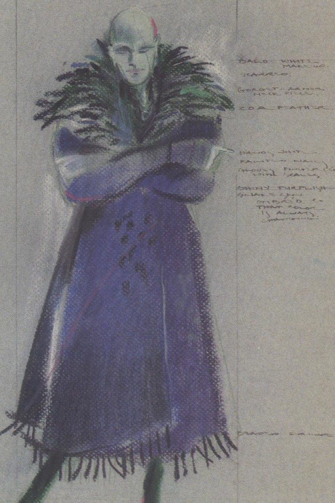
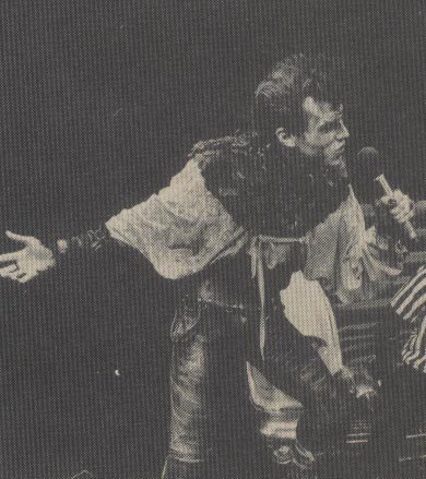
For Tooth of Crime’s Crow at the Berkeley Repertory Theatre, Hilferty used animal imagery and luxurious, unusual fabrics to fashion the look of the “post rock ‘n’ roll bad guy.” For Crow’s robe (sketch, above), which could be pushed back to hang off the shoulders, she used velvet hand-painted in mineral colors. Underneath (photo, right), Hilferty employed a leather cowl reminiscent of fish scales and used more mineral colors, purples, greens, and oranges in the painted stretchy trousers and a leather top that tied across the chest.
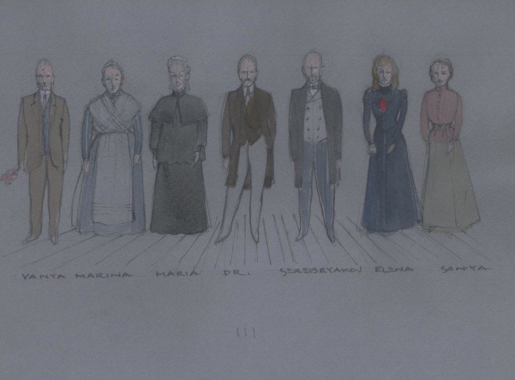
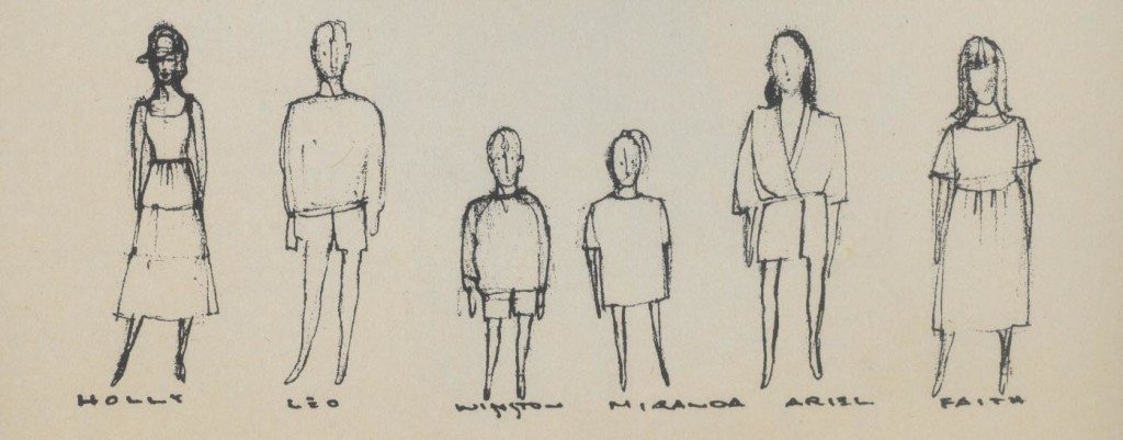
For Uncle Vanya at the Center Stage in Baltimore, Hilferty used silhouettes from the play’s period (sketch, above left) and worked with a clean surface to which she added some small, reduced patterns and simple gestures such as a flower or a brooch. Her approach meshed with Michael Yeargan’s set (photo, below right), clear shapes on a graphic surface.
Exaggeration and animal imagery were the hallmark of Hilferty’s design for the character of Baboon in the BAM Theatre Company’s production of Jungle Of Cities (sketch and photo, above).
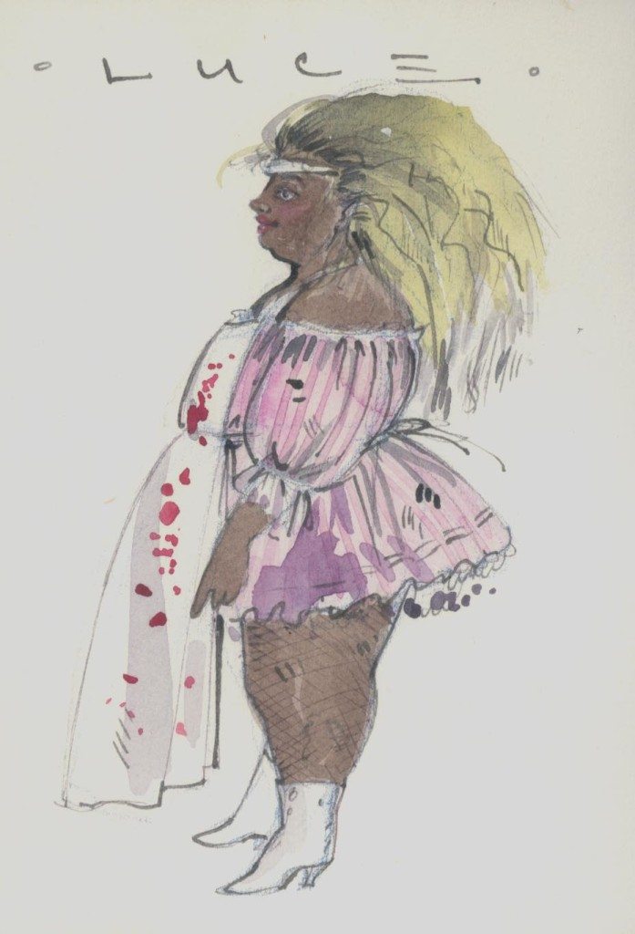
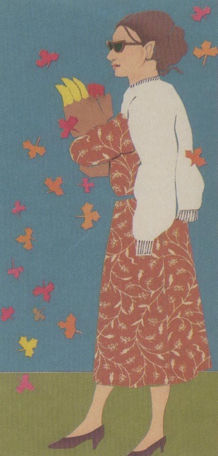
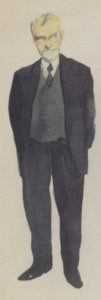
To give playwright/actor Athol Fugard the look of an aging minister in The Road to Mecca at the Promenade Theatre (sketch, above), Hilferty used a slightly oversized old wool suit. “It made him look as if he had gotten older in this suit, shrunk within the suit,” she notes. For Luce in the Flying Karamozov Brothers’ Comedy of Errors at Lincoln Center (sketch,below right), Hilferty “tried to make her a combination of the adorable and the grotesque,” with a French maid’s outfit, blood-spattered apron, and torn fishnet stockings. In All Night Long at the Second Stage, the designer used the seasons as her guide and used paper cut illustrations (sketch, below left). “There was a real storybook quality to it,” she notes. “I had the sense that we were almost illustrating a children’s book.”
For Coastal Disturbances (sketches below), Hilferty grouped her preliminary sketches to give herself an overall view of the relationships in each scene and the way the cast plays together onstage. Hilferty says she uses such sketches “the way a set designer would use a model.”